Infographics Are a Versatile, Valuable Marketing & Communications Tool
From movies and TV shows to comic books and social media, the best and most memorable stories feature the best of verbal and visual. While words are critical to conveying information, most of us don’t just want to read a story or hear a conversation when we can also see it. This is why, one of the most valuable and versatile ways for businesses, marketers, graphic designers, and others to “show and tell” audiences is the infographic.
Through careful arrangement of key elements, including text, images, fonts, icons, and illustrations, infographics are visual representations of information laid out in an engaging and easier-to-digest format. More than simply an educational tool, infographics — when done right — can be a true artform and powerful medium for informing and persuading in creative and compelling ways.
While infographics are utilized across a wide array of industries, they are especially suited for the worlds of marketing and communications, where effective storytelling is so vital across all platforms — from digital channels, such as blogs, YouTube videos, and social media posts, to traditional ones like TV, print publications, and signage.
A dynamic, streamlined way to share ideas and convey stories, data, trends, or instructions, infographics tend to garner greater attention than your traditional web page or article structure with top-to-bottom lines of copy and only occasional images sprinkled throughout.
Infographics offer a near-limitless canvas and multiple different types on which to base your layout. When using and designing infographics for your own marketing needs, it’s important to understand what your options are and the best practices to follow in order to make them as impactful as possible. Now, if you don’t have the right designing and strategic skills at your disposal, it would be wise to reach out to marketing and communications experts like M:7 Agency.
For optimal effect, your infographics should:
-
-
- Stay on-brand (look & feel)
- Optimize space & use copy sparingly
- Include eye-catching colors, images, fonts, & icons
- Use visual elements strategically
- Simplify complex ideas
- Offer an original, creative angle
- Be updated frequently, if needed
- Feature calls-to-action, when possible
-
While infographics have long been static images in such things as reports and signage, the Internet has allowed them to be much more versatile and convenient, utilizing animation, drop-down content, links to sources, and more.
7 Top Infographic Types
Make your website, blogs, presentations, and reports better at telling stories by incorporating one or more of these top seven infographics. Keep in mind that an infographic doesn’t have to be confined to one type; some infographics incorporate more than one type at once.
1. Timeline Infographics
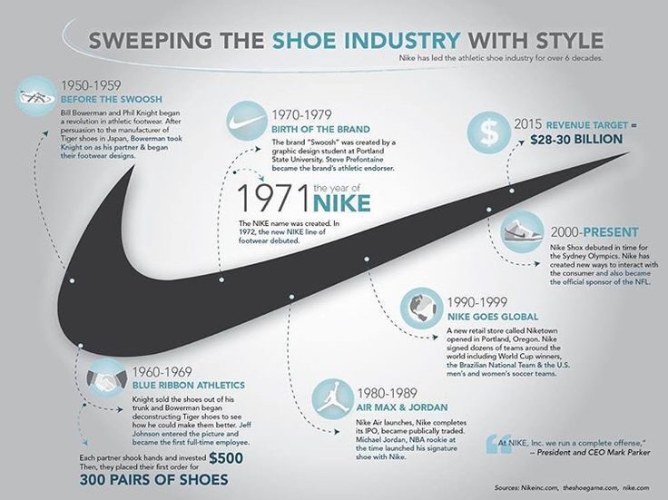
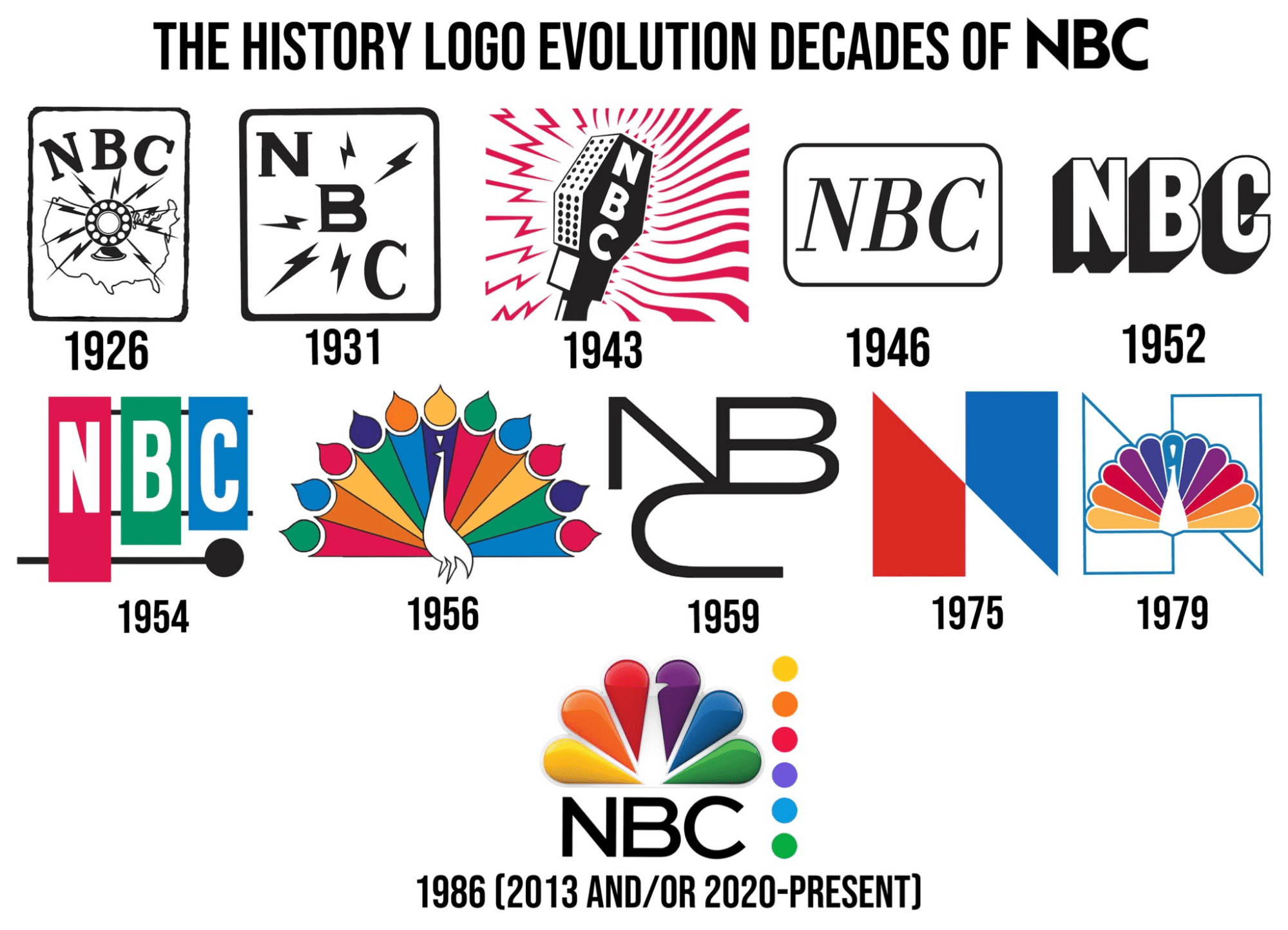
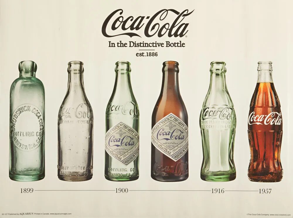
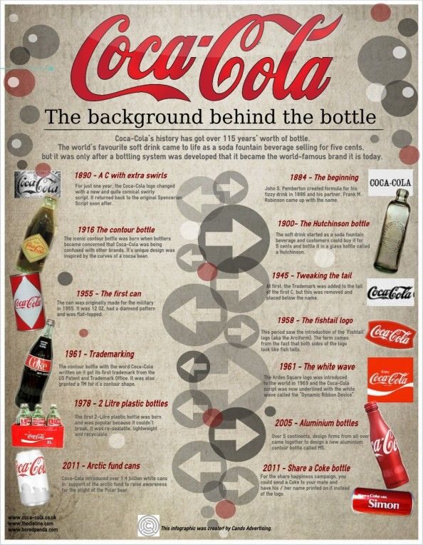
From your company’s history to the evolution of one of your products, a timeline infographic highlights a sequence of events, presenting key moments and milestones in chronological order, typically by year. Keep in mind that the time “line” doesn’t have to be from left to right or top to bottom; in fact, it doesn’t have to have a line at all. However, the copy, images, and dates must work together to demonstrate the progression of its subject matter over time.
As with most infographic types, the balance of copy and images in a timeline infographic typically depends on the subject matter and how much or little information is needed. The same insight can be presented in a number of different ways, which is why infographics are so versatile and rife with possibilities.
2. Process Infographics
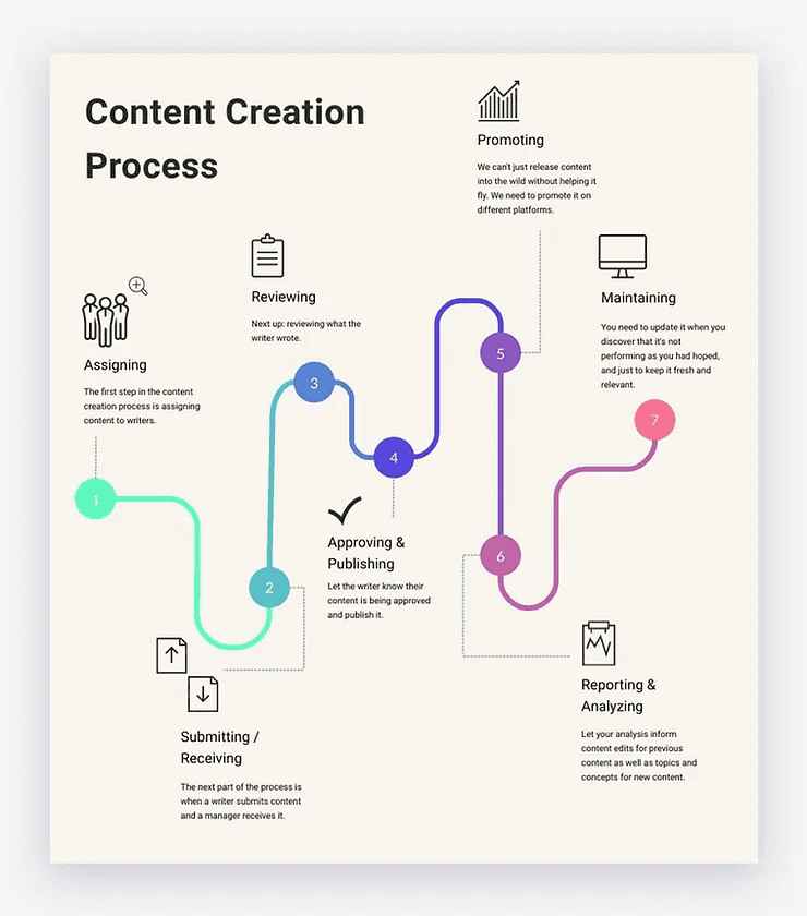
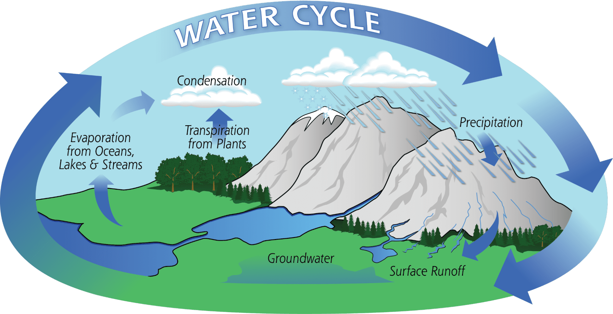
A process infographic is a great way to take a complex procedure or concept and make it more accessible to your audience by simplifying and visualizing its key stages. Think of it as a detailed illustration of the steps one must take to accomplish a specific goal from start to finish. Most process infographics use a path-like visual along with ascending numbers; however, that path can be presented in a number of ways, be it a circle, road, or stack. As with the water cycle, it can also be used to show how a process repeats itself.
3. Map Infographics
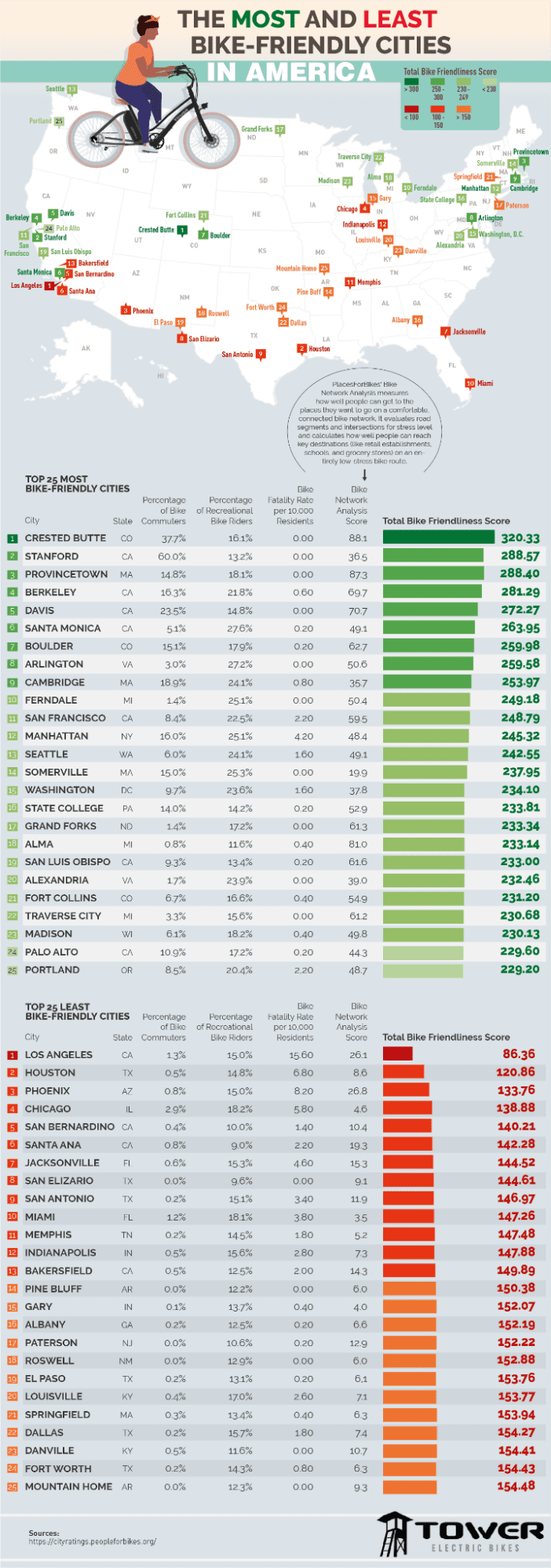
Perfect for presenting demographic data or location-based information, map infographics (or geographic infographics) use maps as the central visual to tell stories and share insight and data around a specific location. Featuring distinct colors, icons, and legends as differentiating elements, map infographics come in a variety of scales — from the whole globe to a particular state, city, or neighborhood.

4. List Infographics
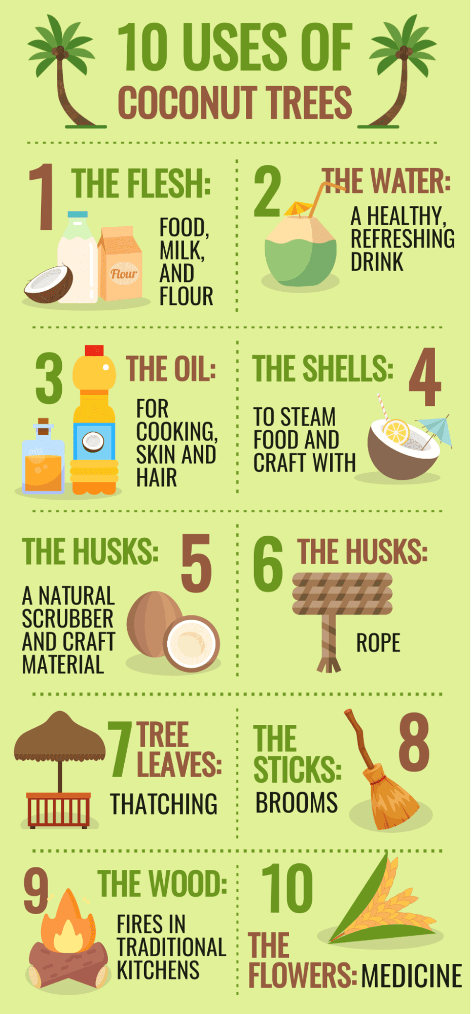
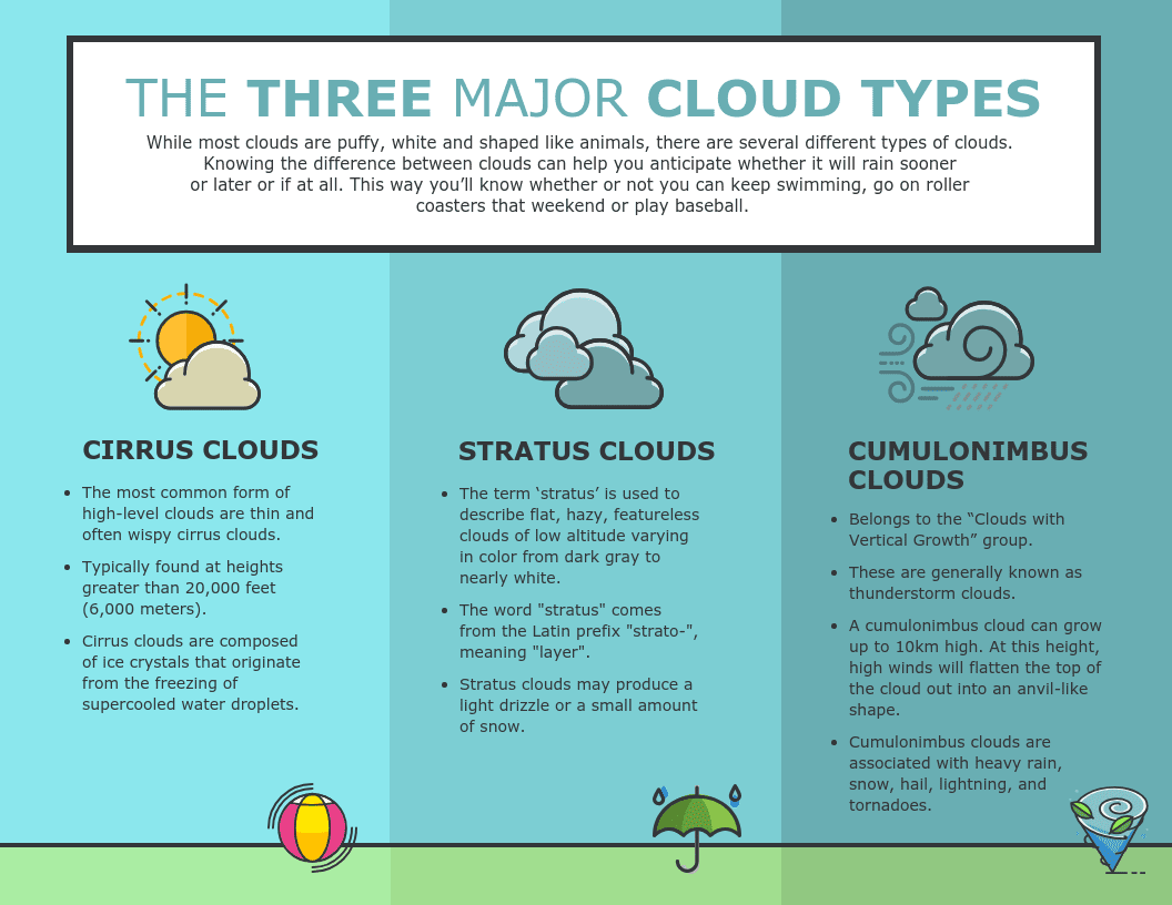
From 10 funniest videos to top-40 song countdowns, humans have an affinity for receiving information through lists, which is why the list infographic is one of the more popular types. Taking an ordinary list and presenting it in a much more interesting way, such infographics often use visuals and colors to separate items rather than bullet points or numbers.
While some list infographics present each item in a particular order, starting or ending with the best of the bunch, the elements of your list infographic don’t necessitate a particular order or have to follow the basic top-to-bottom format. Whether you’re sharing tips, providing a checklist, or showcasing a product’s valuable features, a list infographic is a captivating way to do it.

5. Statistical Infographics
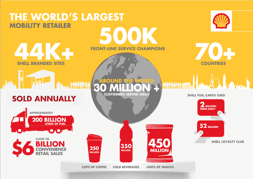
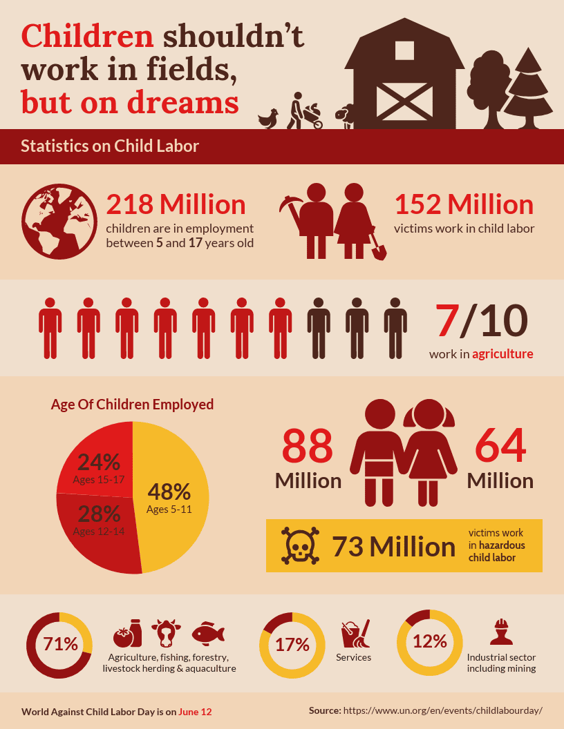
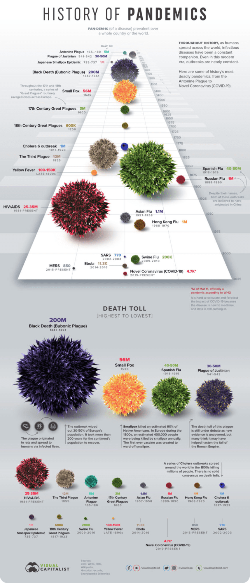
Whenever data, money, or other numbers are involved, they often can and should speak for themselves, and statistical infographics are a great way to let them do so. Utilizing everything from graphs and charts to key numbers in large fonts, a statistical infographic tells a story using data as its focal point. As with any statistically rich presentation, it’s important to include credible sources for that data in order for the story to be as persuasive as possible.
6. Comparison Infographics
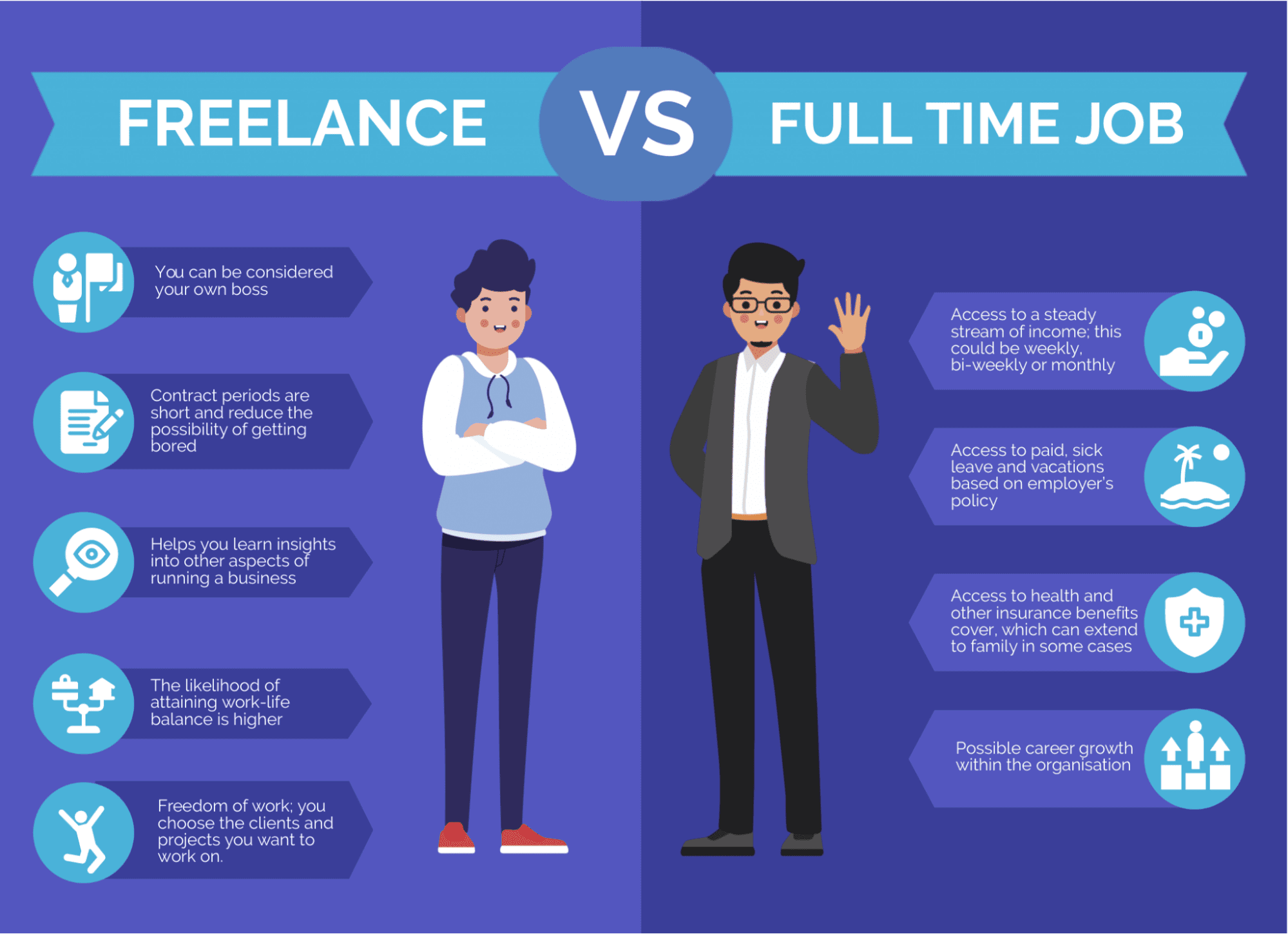
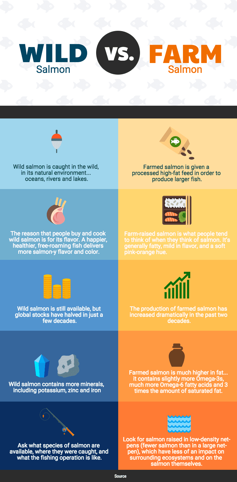
Emphasizing the key differences and/or similarities between two or more objects or ideas, a comparison (or versus) infographic can help a viewer weigh pros and cons of each, see multiple perspectives, or make better choices. Most comparison infographics are split vertically or horizontally, but again, it really depends on your imagination and vision or those of your designer.
7. Flowchart Infographics
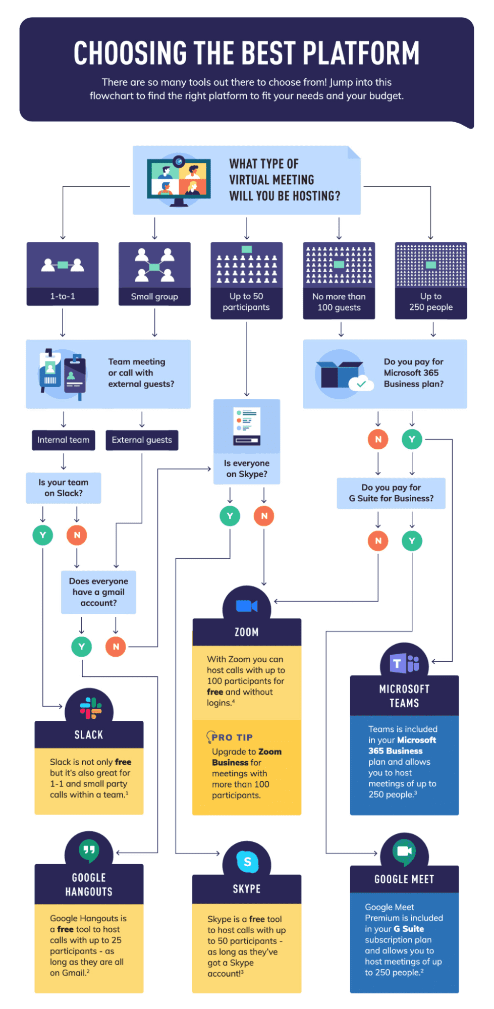
Similar to process infographics in how they go from step to step, flowchart infographics invite the reader to travel along a path of questions to be answered, or options to be chosen, in order to ultimately arrive at a specific solution or decision. Not only can flowchart infographics help guide your audience, but their interactive nature can make them more highly engaging than other infographic types.
These are seven of the top infographics being utilized in marketing today, each of which can help you tell your stories more effectively and engagingly. From digital ads and annual reports to logos and infographics, M:7 Agency has a knack for creating high-quality, standout deliverables that help brands grow their customers, capital, or capacity. Contact us today with your creative, communication, and strategic needs.

