The Way You Order Your Info Can Make or Break Your Message
Why do some brand websites and their pages convert effortlessly while others struggle to get a second glance? While the deal or product being offered plays a big part, more often than not, the biggest factor is the information on the page and the order in which it’s presented.
Some website’s pages feel effortless. You arrive, immediately understand what’s being offered, feel confident it’s for you, and take action without friction. Others feel confusing, disjointed, or overwhelming, causing you to bounce almost instantly.
When visitors have to work to understand what you’re offering, they will likely leave before getting the pitch. But when a website page presents information in the exact sequence prospects need it, conversion becomes a much more natural outcome. That’s the power of content hierarchy.
Great websites and their pages don’t simply present information. They present it in the right order, at the right moment, and in a way that aligns with how real people think and make decisions. When content hierarchy is done correctly, the page tells a story that feels natural and intuitive. When it’s done poorly, even the strongest offers struggle to convert.
Why Content Hierarchy Matters
Before you ask a prospect to convert, you must explain what your offer is. Before you explain the offer, you need to show that you understand the problem they’re trying to solve. And before you talk about yourself, you must demonstrate that you understand the anxieties, doubts, and objections already forming in the visitor’s mind.
Content hierarchy answers a single, foundational question: what does my visitor need to know, and in what order do they need to know it? When that order is wrong, friction is introduced. The page starts to feel like work. Visitors are forced to hunt for clarity, connect dots on their own, or scroll aimlessly hoping the value becomes obvious. When a website page feels like work, people move on to competitors who make it easier on them
Good hierarchy reduces cognitive load. It anticipates questions as they naturally arise and answers them before they become obstacles. It also removes unnecessary information that doesn’t address a real concern or decision point. In a world where attention spans are measured in seconds, eliminating friction is essential.
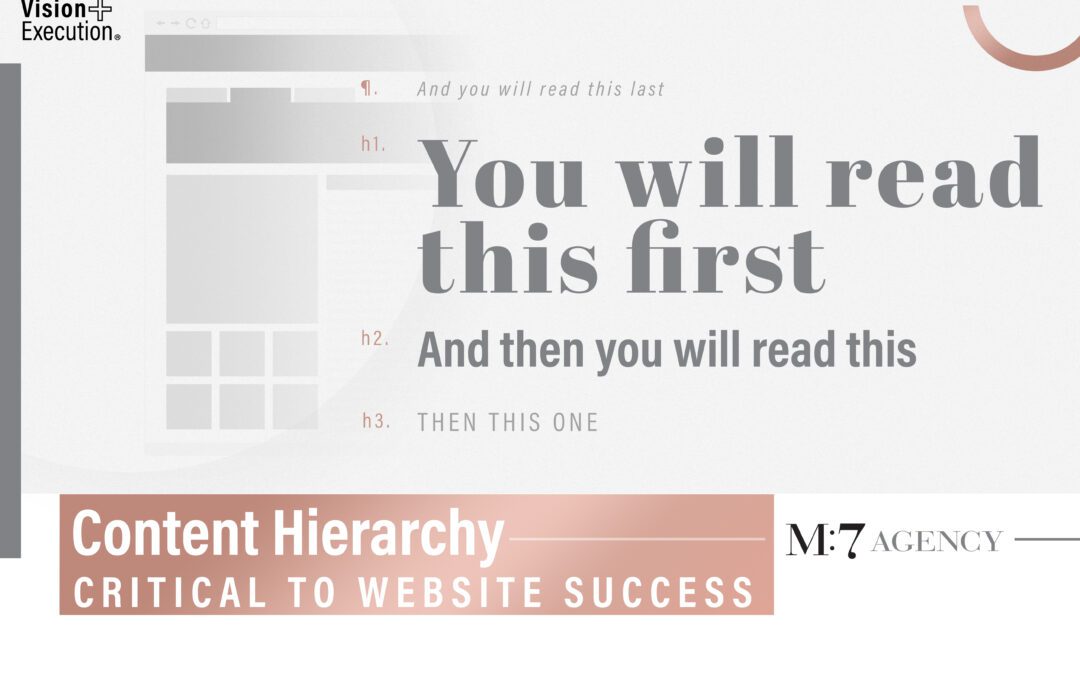
The Main Types of Hierarchy
Content hierarchy is the strategic layer, determining what information is communicated and when. It is the blueprint for the hierarchies of the two main methods used to convey that information: copy and visuals.
Copy hierarchy is how that strategy is expressed through written elements like headlines, subheadlines, body copy, and calls to action. Visual hierarchy is how design elements such as size, contrast, spacing, and color guide the visitor’s eye through the page and the persuasive story you’re trying to tell.
The most effective websites align all three. The content strategy determines the sequence, the copy hierarchy structures the narrative, and the visual hierarchy ensures the design supports that sequence without distraction. When these layers work together, the experience flows more effortlessly and leads the visitor to where you want them to go.
Copy Hierarchy: Building the Narrative
Copy is where meaning is created. It’s how you articulate the problem, present the solution, build credibility, and move someone toward action. Strong website copy is not about saying more; it’s about saying the right things at the right time.
Everything begins with the hook. The hook exists to earn attention in the first few seconds. This might be a compelling headline, a bold promise, or a question that mirrors the visitor’s internal dialogue, or even an implied statement of authority. In some cases, credibility itself becomes the hook. When visitors immediately recognize that you are the best at solving a specific problem, curiosity is triggered without a hard sell.
Once attention is secured, the next priority is showing that you understand the visitor’s problem. This is where trust begins. Effective pages articulate pain points with clarity and precision, often in language that feels uncomfortably accurate. When prospects feel seen and understood, they become far more receptive to what comes next.
After the problem is clearly established, you can then present your product or service as the best solution available, whether because of its quality, convenience, value, or other differentiating factor. This is the moment to explain what your product or service does and, more importantly, what it enables the visitor to do. Benefits matter more than features at this stage. People don’t buy tools or processes; they buy outcomes, relief, and progress.
As interest builds, doubt naturally follows. Visitors begin questioning whether the solution will work for them, whether the brand can be trusted, and whether the offer is worth the investment. High-performing website pages address these objections head-on, weaving reassurance into the narrative rather than hiding it below the fold. This is often where credibility, explanations, guarantees, or clarifying details play their most important role.
Only after value is clear and objections are reduced should the page ask for action. The call to action should feel like the logical next step, not a premature ask. When supported by social proof or validation from others who resemble the visitor, the decision to convert feels safer and more justified.
Visual Hierarchy: Guiding the Messaging Flow
While copy tells the story through words, visual content supports that story with images, graphics, infographics, and other visuals, while controlling how all the content flows and is consumed. Without a strong visual hierarchy, even the most compelling message can be overlooked simply because visitors don’t know where to look first.
From lifestyle to product images, your choice of photography should be captivating, engaging, and relevant to your message. Images should also be of the highest quality not only for search engine optimization (SEO) purposes but also to convey a sense of professionalism and credibility.
Typography is one of the most powerful tools for guiding attention. Larger, bolder text signals importance, while smaller, lighter text communicates supporting information. A clear contrast between these levels creates a natural reading path that requires no conscious effort from the visitor.
Color and contrast serve a similar purpose. Strategic use of color draws attention to key messages and interactive elements. When applied sparingly, contrast becomes a directional tool, subtly telling visitors what matters most. When overused, it creates noise and confusion.
Spacing and alignment play a critical role in shaping flow. White space is not empty space; it’s structure. Proper spacing groups related elements together and separates unrelated ones, making the page easier to scan and understand. When everything is packed too tightly, the page feels overwhelming, regardless of how good the content is.
Consistency ties everything together. Repeating visual patterns, typography styles, and spacing conventions creates a sense of order and professionalism. When visitors don’t have to decode the design, they can focus entirely on the message.
Building a Successful Foundation Through Hierarchy
One of the biggest mistakes marketers make is jumping straight into copywriting or design without first defining the overall content hierarchy, then structuring the copy and visual hierarchies to work together harmoniously. Starting with structure ensures that every element on the page serves a purpose.
A strong foundation begins by clearly stating how the offer relieves a specific pain, then explaining the benefit that relief creates. From there, the page should establish why the brand is uniquely positioned to deliver that solution, address the most common objections, and guide the visitor toward a clear call to action.
This hierarchy foundation works because it mirrors how people think. While the exact order may shift depending on the audience or complexity of the offer, it provides a reliable starting point that can be tested and refined.
Whether you’re looking to develop a new brand website or refresh your current website, M:7 Agency has the strategic and creative experts to ensure your strategy, visual, and verbal come together in the most effective way, including utilizing the optimal content hierarchy. Reach out to us today to discuss your marketing goals and how we can help bring your website vision to life!